A comparison of creating a course template in Canvas by Instructure with 1) only the Rich Text Editor, 2) a combination of HTML Editor and Rich Text Editor, and 3) using custom CSS. Each approach has pros and cons.
![]() Whom do you serve?
Whom do you serve?
There is an old proverb that states “you cannot serve two masters.” It carries an important truth, that in the end, you will have to choose one over the other, as otherwise you have competing directives that you cannot reconcile. If you are like me, you may find yourself in the pickle of “whom do I serve?” on a daily basis, because of the need to service different -- but equally important -- groups of people in the projects you are working on. I found myself asking this question as I was addressing creating a Canvas template on a recent project.
The internal debate swirled around the two main groups I was trying to serve in the creation of the course template: 1) the Course Designers and 2) the Course Maintainers. For the purposes of this discussion, I will define the two groups this way:
Course Designer (CD)
Responsible for the initial design and implementation of the course template and use of the template to help create the first course.
Course Maintainer (CM)
Responsible for maintaining the course template and the initial course after creation, and using the template to create courses other than the first course.
Let’s also define a template for our context:
Course Template
A set of reusable course content components assembled in a prescriptive format as a generic but suggestive guideline for creating a course. Generally, a course is then created by copying the template, and filling in the components with the specific course content. Course templates usually set the “look and feel” of the course as well as the flow of content. Templates contain components for things like headings, paragraphs, callouts, images, video, etc., and also more specific components for things like course outcomes, learning objectives, instructor information, module activities, etc.
You may be feeling like the Course Designer (CD) and the Course Maintainer (CM) are very similar. The main difference I have found (in broad strokes) is in the “technical” knowledge of how to create an online course, in this context specifically through Canvas. For my definition, the CD often has more technical knowledge of the inner workings of the Canvas content editor, and related Web content technologies like HTML and CSS. These people often have a background in, or an actual job position related to experience with Web Design or Web Development, either strictly speaking, or as a cross-over for Learning Experience Designers or Instructional Designers. The level of technical expertise can vary, but it is at least “some.” Again in broad strokes, the CM folks are generally less technical, and more focused on specific course content, and things like pedagogy. Both are important and needed sets of skills in creating good online learning.
Your organization may not have a hard line drawn between these two groups. Maybe you can more easily serve both groups. Maybe you are both groups in one person. Regardless, there are important considerations for choosing between three approaches to creating a course template.
Three approaches to creating a Canvas template
In considering how best to create a course template in Canvas, I have landed on three major approaches:
- Use only the Rich Text Editor
- Use a combination of the HTML Editor and the Rich Text Editor
- Use custom CSS (and largely the HTML Editor)
We’ll take a closer look at each one. For discussion of each approach, let’s first sidestep for a quick refresher on Canvas’s content editor.
Canvas content editor
Canvas provides a Rich Text Editor (RTE), or what is also known as a WYSIWYG editor (an acronym for “what you see is what you get”) for content editing. The goal of an RTE is to allow people to create online content via an online form, by providing an abstraction layer for creating valid HTML markup. This usually takes the form of a preview box where text can be typed, and an associated toolbar with clickable buttons to format text, insert graphics and media, access tool menus, etc.
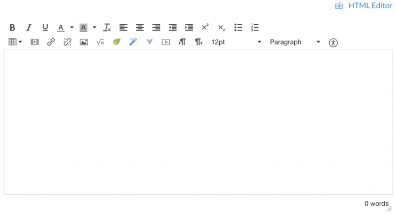
Under the hood, Canvas uses version 4 of the TinyMCE editor, one of the most ubiquitous and popular RTEs. Note that the TinyMCE editor allows for two modes of use, the Rich Content Editor (default), and the HTML Editor. The mode is toggled by clicking the matching text link in the top right corner just above the main editor.
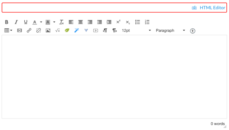
Note that the RTE in Canvas does not allow editing of everything in Canvas. Some parts of the overall UI (like the left navbar) and certain elements (like quizzes) are out of scope of the editor. Even for elements like quizzes, however, Canvas provides an “instructions” area that is editable with the editor.
Since creating course templates and course content in Canvas is done entirely via the editor (unless third-party tools are used), it is important to consider how the RTE will be used by Course Designers and Course Maintainers in their processes and workflows. Let’s take a look at each approach. As we do, we will use an example of creating a component to evaluate the pros and cons.
Use only the Rich Text Editor
The first approach to creating a course template in Canvas is to use only the Rich Text Editor.
Advantages
- No knowledge of HTML or CSS is required.
- What you see in the editor is what you get when the content is saved.
- You can paste content from another format (like Microsoft Word) into the editor and the editor will do a decent job of converting the content while preserving some of the formatting.
- All content can be edited directly within Canvas; no third-party tools or resources are required.
- Changes and overrides can be made directly to each element in the editor.
- Includes an accessibility inspector for creating accessible content.
Disadvantages
- Design and styling is limited to what is offered in the RTE; while it covers simple content well, anything more than the basics is difficult or impossible to accomplish with the editor alone.
- This approach means that all of the content styling is done via inline styles, which is generally considered a breach of best practices.
- Likely requires access to a designer resource to create custom graphic images to accomplish the design.
- Creating any form of responsive design of template components is not possible.
- Changes to styling have to be done at each and every place that styling was used across the entire course, which can amount to significant effort and human error.
Here’s a component example to see how it plays out: we will create a stylized heading banner for the course.
Example: Stylized heading banner
We will try to create a banner that has a logo and course title. The goal is to make the banner a visually appealing landmark for the course home page. In this example, I want a white version of the Unicon logo on a blue background, with the course title directly underneath in a box of a different color.
I start by adding the Unicon logo. Since the logo image is white with a transparent background, it actually appears “invisible” in the viewer. But I know it is there, and am able to select it. The desire is to put the logo on a background color that is an official blue from the Unicon color palette. As can be seen in the screenshot below, however, the editor limits my background color choices to a specific color set, none of which is the official blue color I need. For the example, I will just pick one off of the given palette.
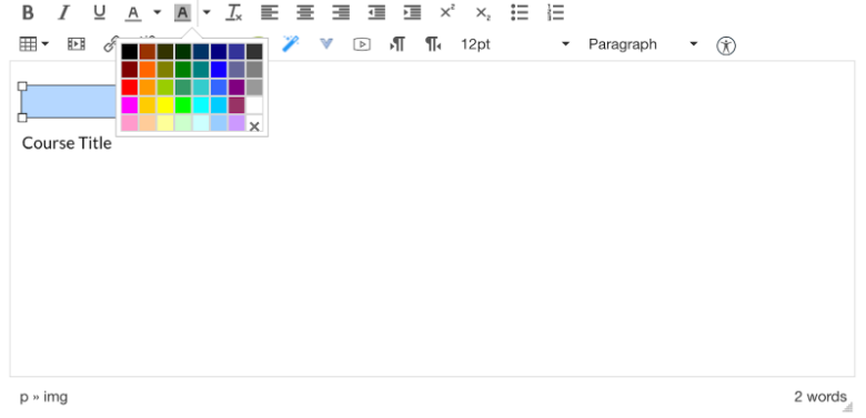
Example: creating a course banner using the RTE only. Selecting background colors.
After selecting a background color, however, it becomes apparent that the color will not achieve a banner format (stretching the full width of the view), nor does it even really fill in the whole background of the image itself, but is kind of chopped off top and bottom. I also am not given any controls for adjusting the padding or margins around the logo to give it some breathing room and visual elegance. It works similarly for the course title; while it at least fills in behind all the text, it feels cramped and actually appears more like text I have selected rather than the banner style I am trying to achieve. The limited color palette also prevents me from getting the colors I want (and maybe need for appropriate color contrast). Also I cannot change the font of the course title to get the desired typography.
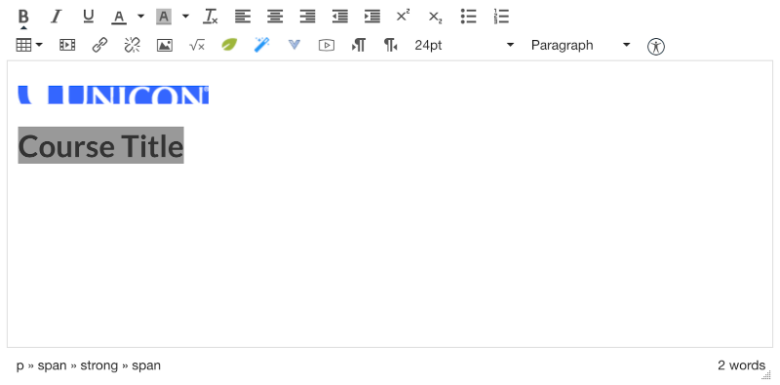
So I am thinking this result is rather unacceptable for my client and their learners, and will not make it past the wardens of the brand as a representation of good course design. What shall I do? It turns out that the only viable path forward to achieve what I need is to turn the entire banner into a large image.
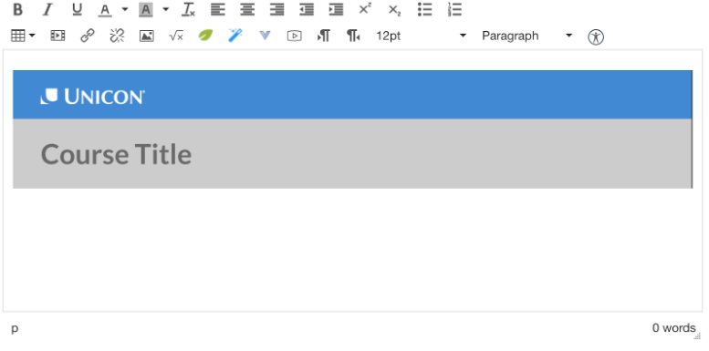
Not bad, problem solved, right? Well visually it now looks like I was expecting, but it has some caveats. Since the banner is an image, that is an additional asset that will need to be downloaded and cached in the user’s browser to view the page. Which might be okay for one or two images, but if most everything that has visual styling needs to be made into an image, that gets problematic. If for any reason the image cannot be loaded, the learners now get a “broken image” experience. As an image, it is a fixed size and resolution, which means that it won’t flex and scale to the width of the view. So if the view is wider than my image, it will seem too short and cut off, and if the view is narrower than my image, it will rescale the image to shrink to fit, making my banner less impressive and elegant than I desire, or it will cut off the image at an arbitrary place. Additionally, the text of the course title is now taken out of the actual course content and made more hidden to assistive technologies like screen readers. Finally, if I have to make any kind of edits to the course title (which never happens, right?!), I am forced to edit the image instead of just the text, and all of the pains that come with having to re-upload an image and manage an image repository.
Other major limitations I have run into using just the RTE revolve around grids and responsive design. The only layout mechanism provided by the RTE is a data table, which really is not supposed to be used for layout anyway (it violates all kinds of best practices). Data tables are also notoriously poor at responsive design. The end result of using just the RTE are pages with no grid/column layout options, which makes for extremely vanilla content.
Summary
Using only the RTE has several advantages for template and content authoring that requires little to no technical knowledge and can all be done directly within Canvas without modification, plugins, or third-party tools. However, the limitations of the editor on aspects of visual design, layout, accessibility, and responsive design are severe. It might work for a text-and-images only course, but is often a deal breaker for developing engaging courses and brand fidelity.
Use a combination of the HTML Editor and the Rich Text Editor
The second approach to creating a course template in Canvas is to use both the Rich Text Editor and the HTML Editor.
Advantages
- Allows for greatly expanded visual design without resorting to images.
- What you see in the editor is what you get when the content is saved.
- You can still paste content from another format (like Microsoft Word) into the RTE and the editor will do a decent job of converting the content while preserving some of the formatting. But the result will probably require additional editing in the HTML Editor
- All content can be edited directly within Canvas, but you might want to use a third-party code editor in tandem.
- Changes and overrides can be made directly to each element in the editor.
- Can still use the included accessibility inspector for creating accessible content.
Disadvantages
- Requires knowledge of HTML and CSS, or access to a person that does, at least for the template creation.
- The editor sanitizes what you code into the HTML editor when it saves the content and it does not accept the full range of HTML and CSS possibilities. Some things are still very difficult or impossible to achieve.
- This approach means that all of the content styling is done via inline styles, which is generally considered a breach of best practices.
- Creating any form of responsive design is not possible.
- Changes to styling have to be done at each and every place that styling was used across the entire course, which can amount to significant effort and human error.
Let’s see how this approach does with our example.
Example: Stylized heading banner
My goal is to make the banner a visually appealing landmark for the course home page, with a white version of the logo on a specific blue background, with the course title directly underneath in a box of a different color.
In order to achieve this, I started with the same thing: in the RTE, I added the logo, and then typed in the course title. After that I switched to the HTML Editor (HE) to see what I had.
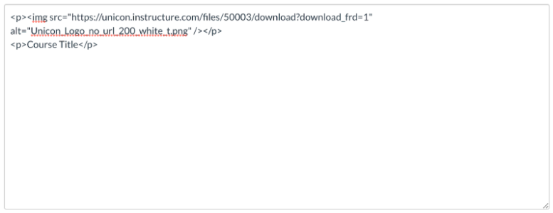
From here, I edited the code in the HE until I had what I wanted. The nice part is you can quickly switch back and forth between the HE and RTE to get a visual preview of the result.
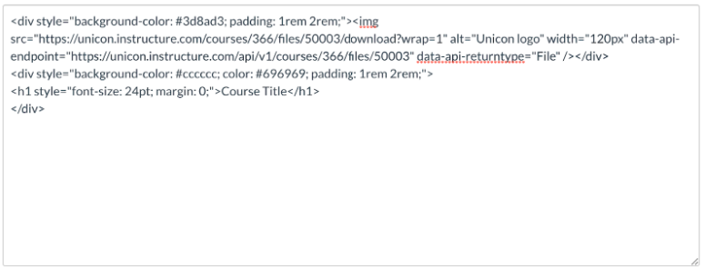
Example: creating a course banner using the RTE and HE. Editing the markup. Notice the inline styles.
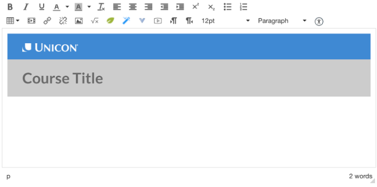
Visually, it looks just as good as the image in the RTE-only approach and it has the advantages of not being an image. It will flex horizontally to fit the width of the screen it is on, and the title of the course is in the course content, making it editable text within the editor and more semantic to assistive technologies like screen readers. Because I can specify color values in the markup, I can be sure I am getting the exact colors I want. Unfortunately, the styles are inline. Also, code editing in the HE gets difficult when there is more than just a small snippet of code in there. Finding your place and ensuring you have made the correct edits, and not introduced syntax errors within the HE is rather difficult. I found myself instead authoring in my favorite code editor to gain all the benefits of formatting, highlighting, error-checking, and the like, and then copying the code back into the HE to see the result. The extra back and forth got tiresome, but it worked.
For the project I was on, this process worked reasonably well. It balanced allowing for richer design of components, while keeping everything within Canvas. While requiring initial expertise in HTML and CSS to create the template components, once they were set up, we found they were very durable to being edited solely in the RTE. What that meant was there were some wins for both the Course Designers and the Course Maintainers. CD’s had more freedom to create components that met the desired fidelity of the brand and engagement level, and CM’s were able to edit the content of those components solely in the Rich Text Editor without having to monkey in the code view. There were a few places where CM’s did have to get into the code view, but largely they were able to operate at the non-code level.
Mentioned in the “Disadvantages” above, the HE does sanitize the code you enter, and some things will get stripped out. In the current version of the editor, I discovered that it will strip out any <style> element, meaning that everything has to be inline styles. Same for inline styles trying to use CSS grids, though flex declarations would persist. Which meant that some grid-type layouts could be accomplished, but since there was not also a way to declare media queries, true responsive design was still not achievable. Even some run-of-the-mill styles like border-radius would get stripped, leaving a rather boxy, and unrefined result.
Summary
Using a combination of both the RTE and HE produced a satisfactory result up to a point. If you have access to a person or team of folks that are proficient enough in HTML/CSS, this is a viable approach. Coding directly in the HE quickly becomes problematic, so an outside code editor is really required. Style possibilities are much improved over the RTE-only approach, but some key pieces like grids and responsive design are still missing. With this approach, everything is still accomplished within Canvas and does not require adding outside tools. If you are developing large courses, and/or multiple courses, bear in mind that making even a simple change to a component (like changing the course banner color from blue to green) means physically hand-editing it everywhere the component is used. For both CDs and CMs, that can quickly become unwieldy.
Using custom CSS
The third approach uses custom CSS developed outside of Canvas and included via Canvas’s Theme Editor.
Advantages
- Allows for the full range of CSS styling of components.
- Allows for use of grids and complex layouts.
- Allows for responsive design of components and layouts.
- You can still paste content from another format (like Microsoft Word) into the RTE and the editor will do a decent job of converting the content while preserving some of the formatting (inline). But the result will require HTML editing to take advantage of the custom CSS.
- All course content can be edited directly within Canvas and tie into the custom CSS via the HTML Editor.
- Use of a global stylesheet vastly reduces the amount of inline styles, conforming better to best practices and also makes the markup more human-readable.
- Use of a global stylesheet means that changing style elements (like from blue to green) can be done in one place and affect all components instantly.
- Changes and overrides can still be made directly to each element in the editor, but will be inline styles and might encounter specificity conflicts with the cascading nature of a global stylesheet.
- Can still use the included accessibility inspector for creating accessible content, with some caveats.
Disadvantages
- Requires knowledge of HTML and CSS, or access to a person that does, for most all content creation, editing, and maintenance.
- Breaks the WYSIWYG nature of the editor because the custom stylesheet is not available when in edit mode, so you can’t really preview the content until it has been saved, which makes using the RTE much less intuitive and fun.
- Ties the course to the Canvas instance where the global stylesheet is registered. Taking the course outside of that Canvas means the course will appear very broken when rendered without the stylesheet. This generally prevents a course from being put into Canvas Commons, for example.
Let’s see how this approach handles our example.
Example: Stylized heading banner
As with previous approaches, my goal is to make the banner a visually appealing landmark for the course home page, with a white version of the logo on a specific blue background, with the course title directly underneath in a box of a different color.
Utilizing a custom stylesheet requires an Admin-level user to configure the Canvas instance to allow uploading of custom files to Canvas’s themes. After having an admin turn on the switch, I followed these instructions for How do I upload custom JavaScript and CSS files to an account?
After whipping up a quick CSS stylesheet and loading it into the Canvas theme for my course, I put together a simple markup structure for my banner component.
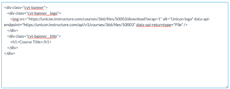
Then I flipped over to the RTE view to preview how it would look:
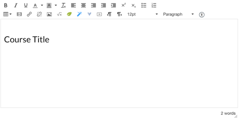
...and I noticed that none of my custom CSS styling came through. In the preview it looked like it had no styles at all. Which in essence it did not, because the RTE does not load my custom stylesheet and has no awareness of it. WYSIWYG busted! That is a major downside for both CDs and CMs in using this approach. After you save the edits, however, when the content is outside the editor, it picks up the custom styles and renders correctly. Using a custom CSS also provided me the ability to add some elegant touches like a subtle gradient background and rounded corners.
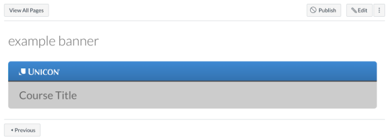
As someone who is comfortable with HTML and CSS, this approach worked great for me in creating the course template components. I was able to achieve the desired visual result and brand fidelity, which made the whole course feel more compelling and engaging, even with the same content as previous approaches. I felt like a good citizen in producing a result that adhered to best practices. When the request comes to change the color from blue to green, I can change it in one location in 5 minutes or less and have the change propagate across any courses that use the stylesheet.
This approach also opened up the use of CSS grids for layout and full responsive design options, solving several other key issues. It also made authoring course content much more efficient, not having to hand-craft everything and also not having to wade through the clutter of all the inline code.
A slight negative to this approach is that since the stylesheet is not loaded into the editor, it affects the ability of the editor’s accessibility checker, particularly around color contrast. Without the styles applied, the checker uses what it has (basically unstyled components) to make a determination of color contrast issues. If the markup is authored well, the checker still functions to near-full capabilities, but in the area of color contrast it will report errors that it is seeing in the editor that are not really true of the final result.
Also an annoyance during the creation of the template components is that the process of going from looking at a course page, to uploading a new version of the custom CSS, to returning to view the results on the course content takes close to 20 clicks. It also requires an admin-level permission, meaning that if you don’t want to give your course designer admin access, then the admin is likely in for a situation where the designer is asking the admin to upload the custom CSS again, and again, and again. Because that is generally the way CSS is developed: write some, check the result, repeat. You can do some of this with browser dev tools, but nothing quite beats seeing the results in the actual environment.
As a final note on this approach, Canvas’s theme editor allows you to only upload one custom CSS (and one JS) per theme. Meaning that if you plan to (or need to) add CSS for other plugins or tools, you are in for mashing those CSS into a single, combined file and managing that Frankenstien going forward.
Summary
Using the approach of custom CSS produced the best components overall, allowing for elegant styling, while supporting grids, and supporting responsive design. Particularly for Course Designers that are familiar with HTML and CSS, I would recommend this approach. Due to having most of the styles stored in one place, it also makes for much less effort for Course Maintainers, but does require the technical knowledge and admin-level Canvas access. The main downside of this approach is that it breaks the WYSIWYG nature of the editor. You can still see the results after you save the content, but involving non-technical CDs or CMs becomes more difficult.
What is the best approach?
I wish there was a clear, best approach. As you can probably tell from my experience, the Custom CSS approach worked best for me. However, as is the usual case, the best approach is going to be dependent on the specifics of your project. A relatively straightforward course done by entirely non-technical folks might be served very well with the RTE-only approach. A course with a known requirement to be served up in unknown Canvas instances will probably require an approach other than the Custom CSS. For a technical team to set up the course template and non-technical folks to maintain afterwards, the both RTE+HE approach might be a great fit.
Final Thoughts
I hope that what I have learned journeying through Canvas course template creation can help you on your journey, and hopefully save you some of the blood, sweat, and tears that I have shed in the process. Thankfully, Canvas offers the capability to approach course design in several ways to fit different needs and styles. Likely, I still have a lot to learn. Maybe you have an approach outside of these three that has worked great for you. If so, I’d love to hear from you.
